Background
Lloyds Banking Group sought to accelerate their digital transformation to align with customer needs, streamline design operations, and cut costs. As part of this endeavour, they aimed to transition individual brand libraries based in Sketch to a white label design system built in Figma.
Intelligent Finance, one of the lesser-known brands within the group, was chosen as a testing ground to evaluate the feasibility of migrating the banking system and infrastructure to a new code base and storage platform.

Challenge
• Align customer experience with the established journeys present across the rest of Lloyds Banking Group
• Update the branding of Intelligent Finance, which had remained unchanged since its inception in the 90s.
Role
Upon joining the project six months into its development, my foremost task was to lead the brand refresh. Once the branding was in a satisfactory state, I transitioned to supporting the expansion of the Design system and collaborating across various journeys within the project.
Project approach
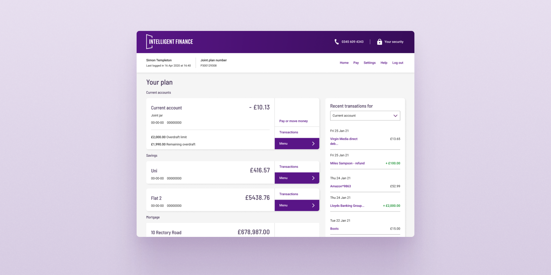
Within the initial six months, a rapid first release was executed to establish core journeys for testing with users. Subsequently, the teams expanded upon these journeys to comprehensively outline all requirements and user flows, refining the user interface in the process. This was all to be supported by a fully functioning Design system that could be applied to brands in the future.
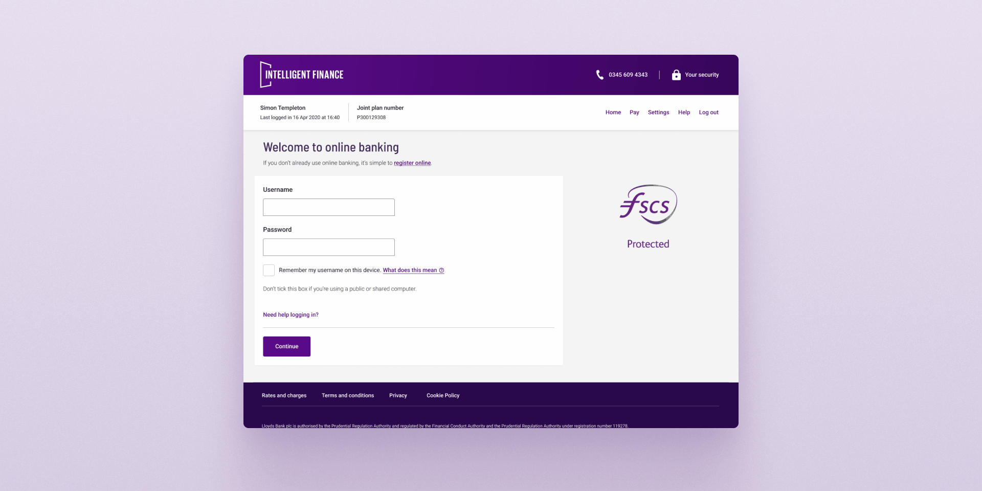
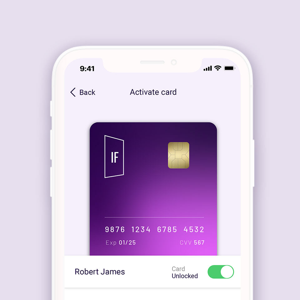
Brand Refresh
On being asked to look at the brand refresh I realised the only existing brand assets were a logo and an outdated website. There were no brand guidelines and no brand strategy. However after some initial exploratory work and following discussions with Group Brands and Marketing, it was clear that a 'light touch' brand refresh was the appropriate approach. Rather than a complete rebrand, the goal was to modernise the brand for 2021 without alienating existing customers.
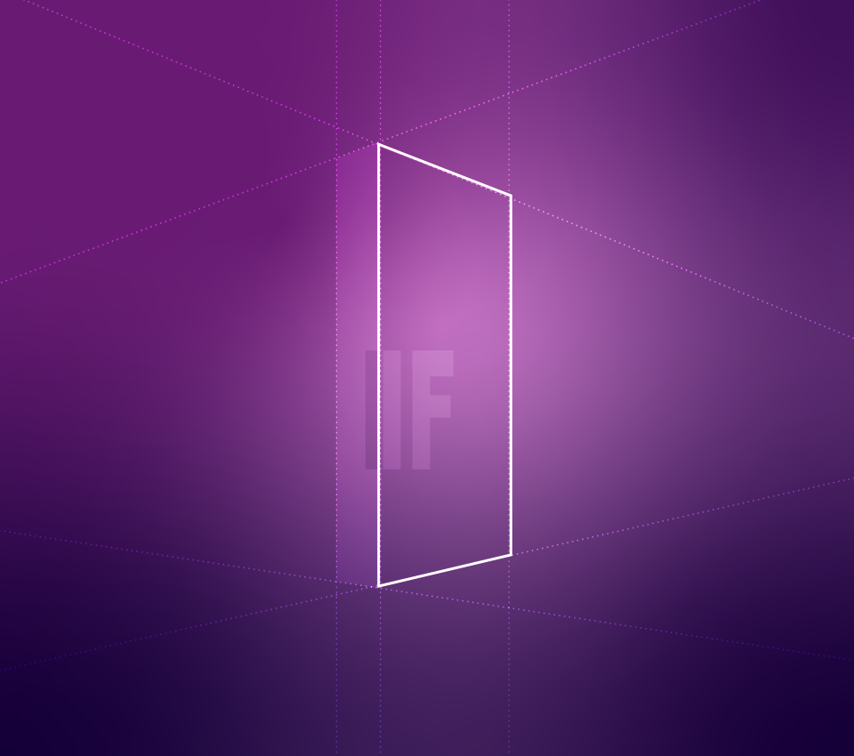
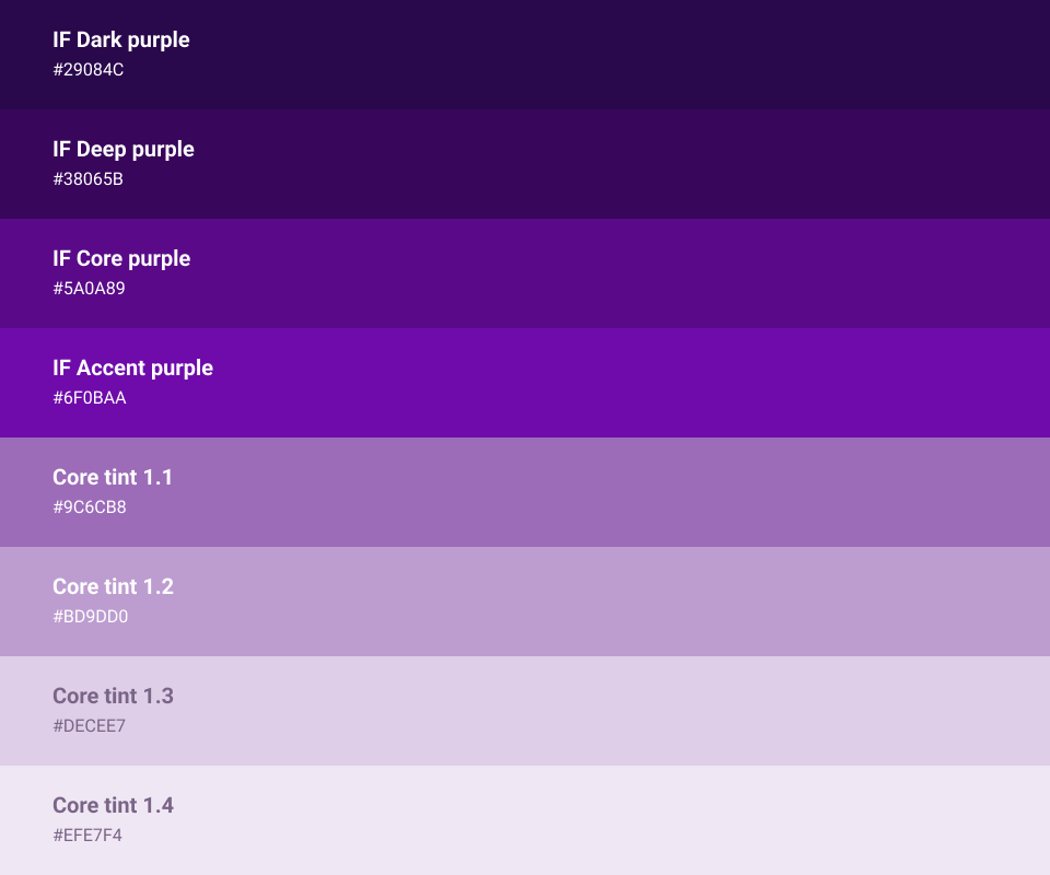
I examined ways to refine the existing logo, opting for a cleaner aesthetic, and introduced a lighter typeface for the wordmark. Additionally, I explored adapting the colour palette for a more sophisticated appearance and devised various treatments for imagery, both photography and illustration, to align with the refreshed brand identity.
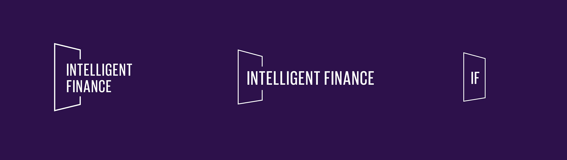
Updated logo mark
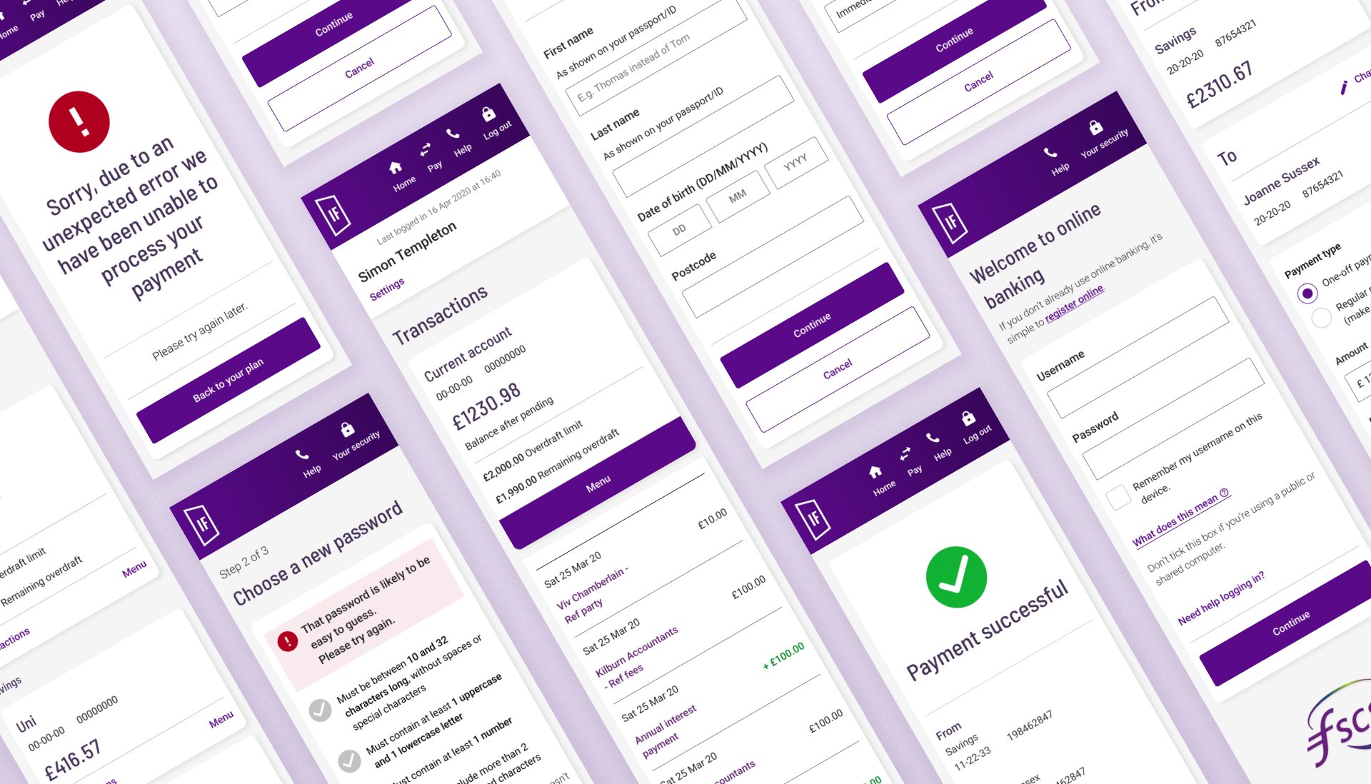
The design system
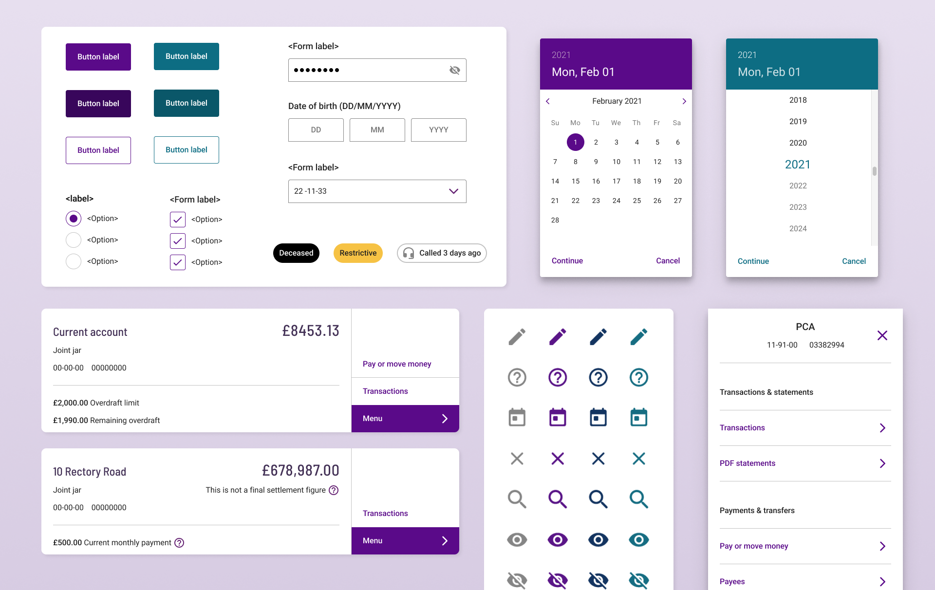
While some basic elements existed in the design system, a complete restructuring was necessary, requiring us to build it anew from the ground up. Numerous inconsistencies arose in both design and implementation, prompting close collaboration with the development team to ensure seamless alignment between design and build processes.
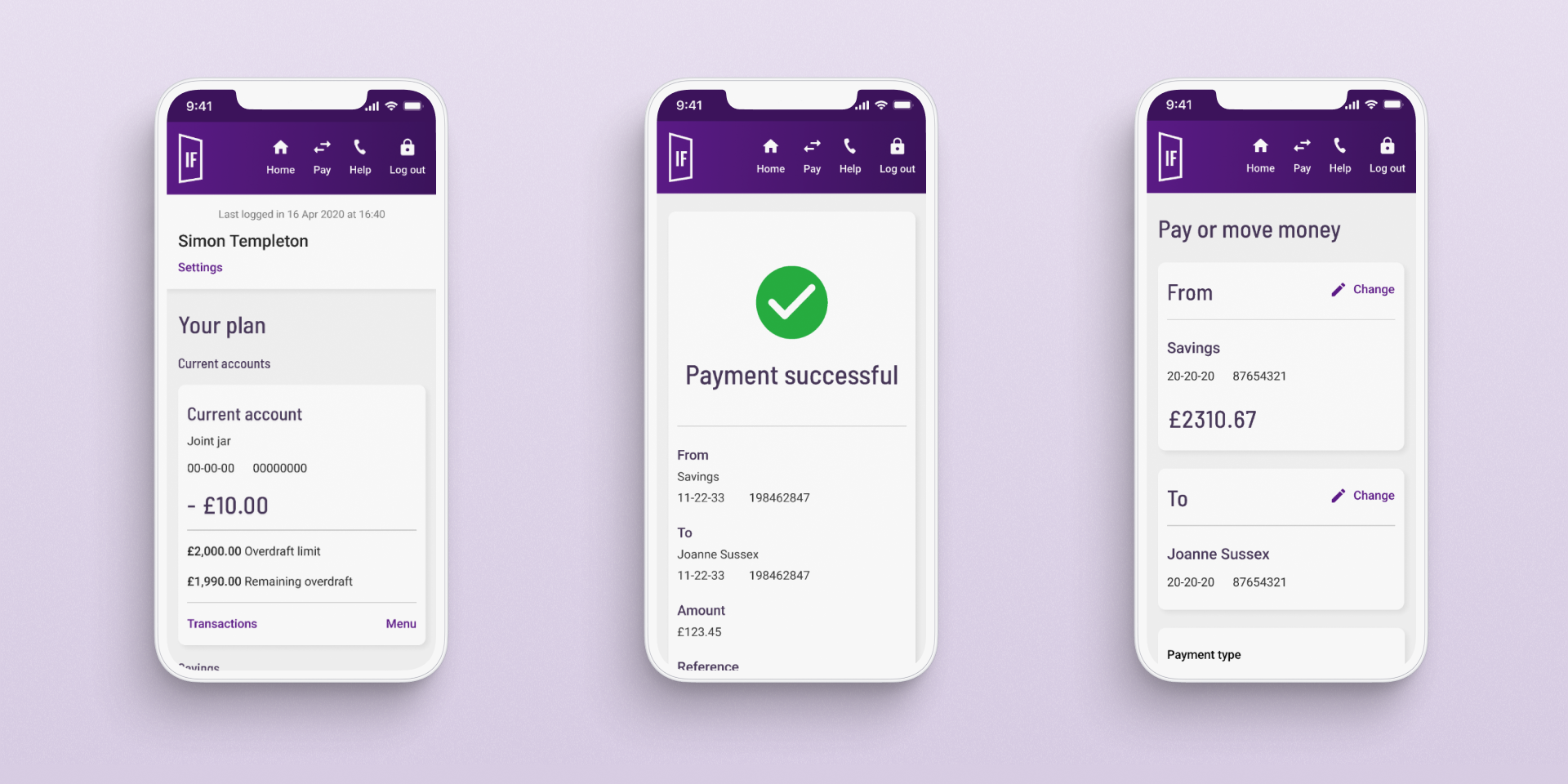
All components and design patterns were reviewed before being fed into the Design system where they were refined and built into components using Figma. After establishing the base components, we utilised 'variants' in Figma to encompass all different instances of each component, allowing us to design and build colleague and customer experiences in parallel.

Results
The final outcome was a scalable design system, which could work across multiple brands and different viewports. It contained more than 50 components to be applied on 5 responsive templates, all designed and built to WCAG accessibility standards, improving usability across almost 100 journeys.
The new design system allowed teams to design with speed creating pixel perfect designs from reusable lego block components and pre-defined auto-layout templates.
The design system also found recognition with Figma advocates as “One of the best design systems seen that is built to a gold standard”.