Background
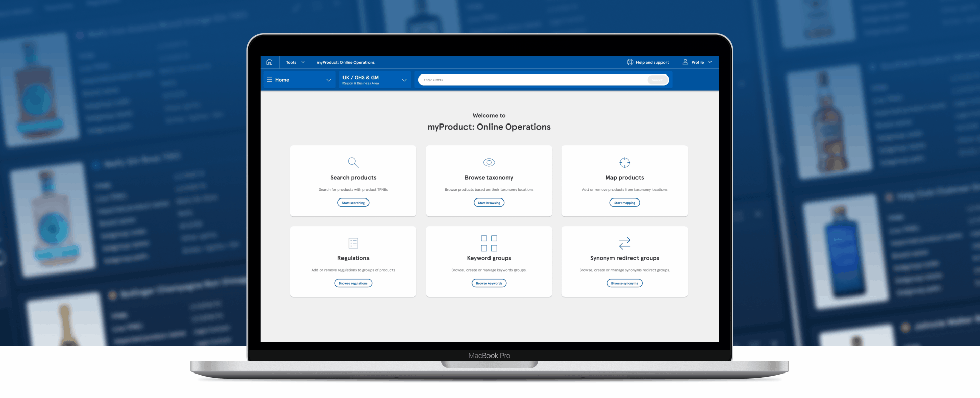
Online Operations is part of a suite of ten applications designed for colleagues and suppliers to oversee product management at Tesco. This specialised team oversees diverse responsibilities such as product taxonomy management, compliance with product regulations, and handling keyword search terms. In essence, they function as the virtual storekeepers for Tesco's online platform.
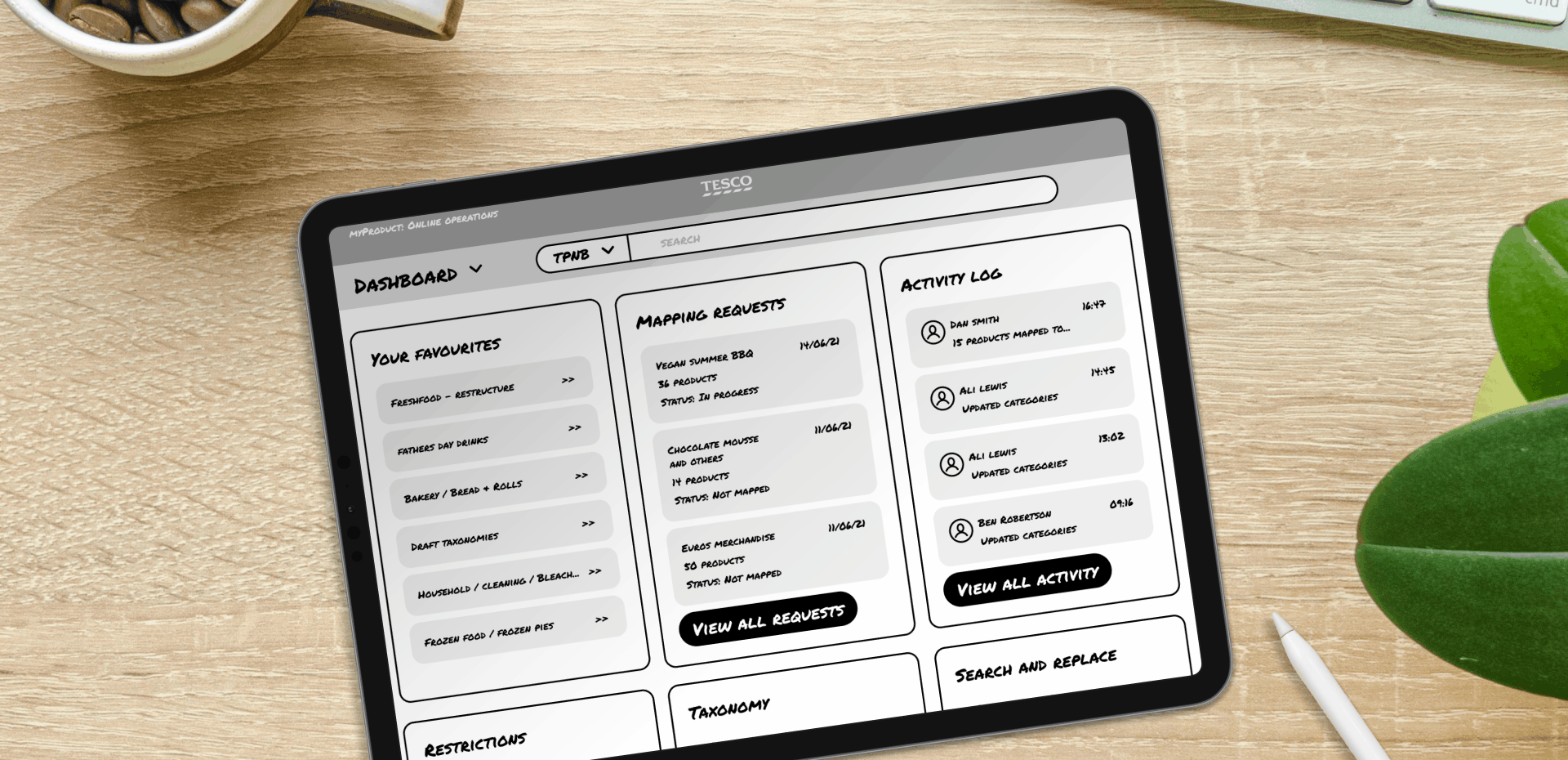
Examples of early exploration into the other products.
Problem
The team's processes were complex and prone to human error. The primary application, Sonetto, utilised for taxonomy management, was a third-party tool incurring substantial costs for the business. Furthermore, the tool proved inadequate, being sluggish, unwieldy, and hindering users from performing their tasks efficiently.
Brief
Develop a user-friendly application to replace Sonetto, integrating enhanced functionality for streamlined daily tasks. The new tool should consolidate all operations into one efficient platform. The tool will be designed using the newly established Enterprise Design system, additionally, new designs for the application will feedback and contribute to the ongoing refinement of the design system.
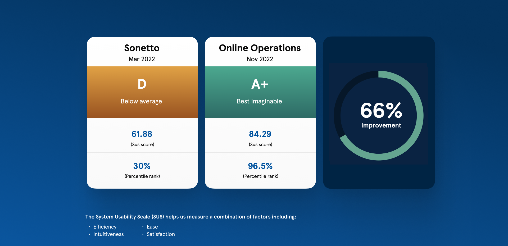
Results from the SUS survey after the first release
Role
The nature of the project required specialist UX researchers/problem solvers and specialist UI designers. My role as senior UI/product designer meant I worked closely with the UX guys problem solving the best solutions for how the tool should work, thoroughly testing those ideas and then progressing them to polished designs. Furthermore it was my responsibility to make sure as a team we were aligned to the other tools in the suite. This meant active participation in design crits and evolving the designs holistically.
Ways of working
As a recently formed remote team operating across various time zones, it was crucial to define our work processes from the outset to ensure alignment. This involved seeking input from everyone, ranging from PMs to devs, to collectively shape the project's operational framework. We established designated hours for collaborative work, determined the frequency and participants for weekly ceremonies, and implemented monthly retros to reflect and make adjustments if needed. While it took some initial effort to refine, after a few months, our team was operating seamlessly.
Idea exploration
Identifying user needs
By conducting user interviews, we delved into the intricacies of the user experience, identifying specific pain points, essential and redundant features. Mapping out these experiences provided valuable insights and gave us a holistic understanding of the product and allowed us to start thinking about improvements and innovations.
Ideation and journey mapping
We involved our small user base early on, holding workshops to brainstorm ideas and learn about their needs and preferences. This collaboration helped us understand what was necessary and explore different ideas when we started mapping out the journeys.
As the journeys matured we maintained close collaboration with our users identifying potential issues and confirming if our designs were on the right path.

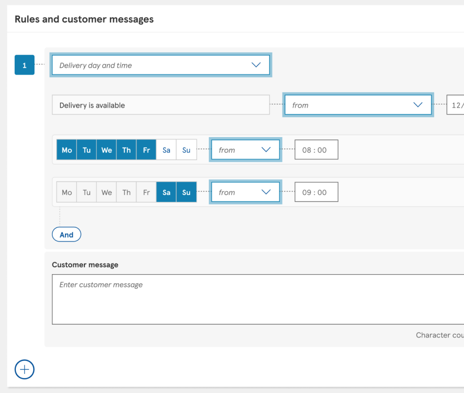
All existing journeys were mapped
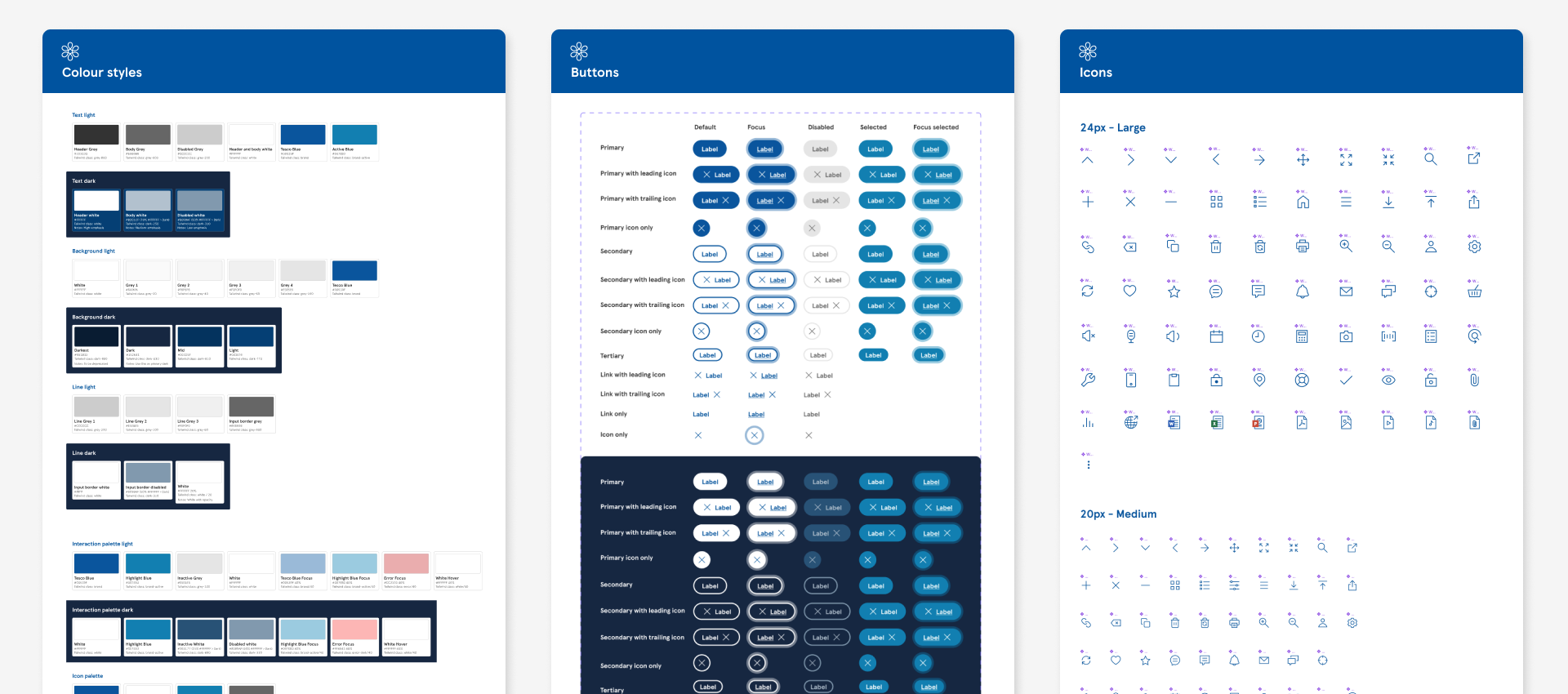
UI Design and the design system
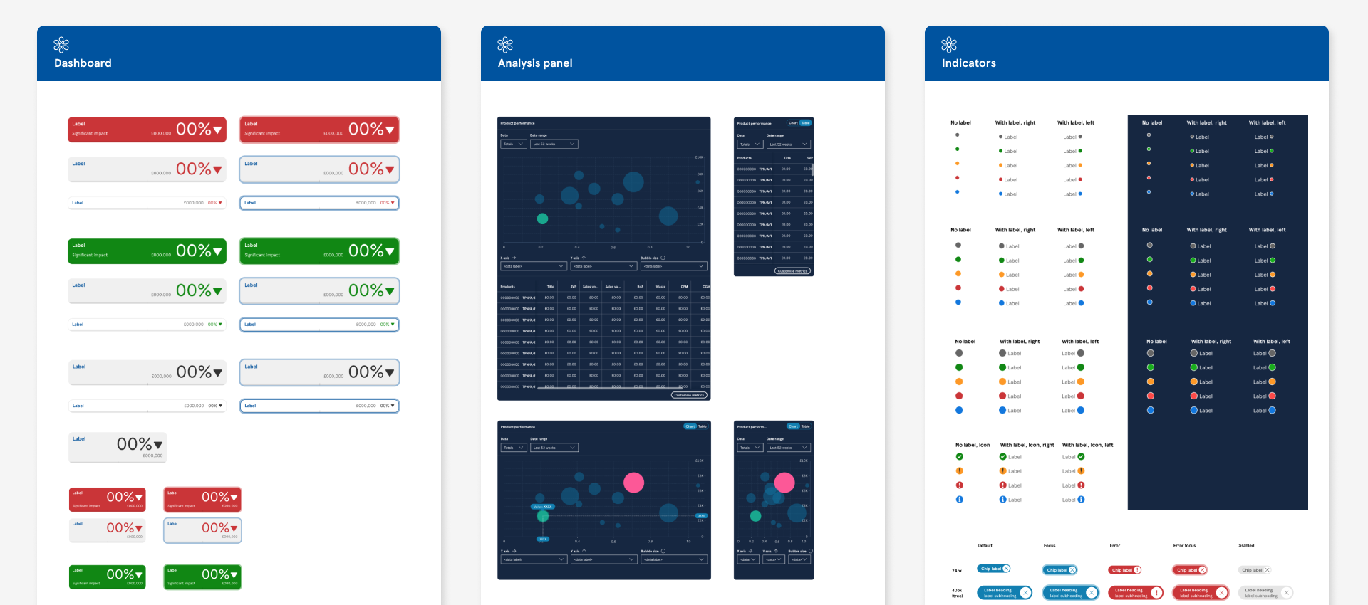
When I joined the project the design system we were using for this suite of products was in it’s infancy. While some products had begun incorporating shared components, inconsistencies were already emerging. Although there had been significant efforts to envision the potential of the app suite, less attention had been given to the foundational aspects and details.
Each app presented it’s own unique design challenges so there were many design patterns that were exclusive to specific apps but naturally there were also a lot of shared components. As a team comprising over 10 designers, effective collaboration was crucial to uphold consistency and advance the design system collectively.
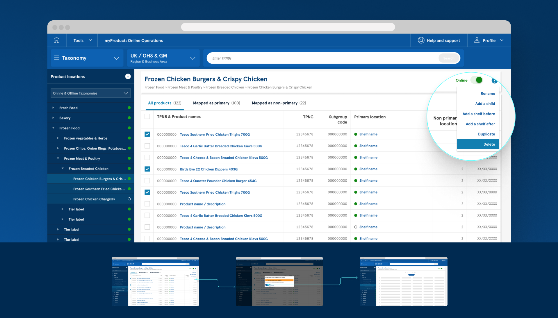
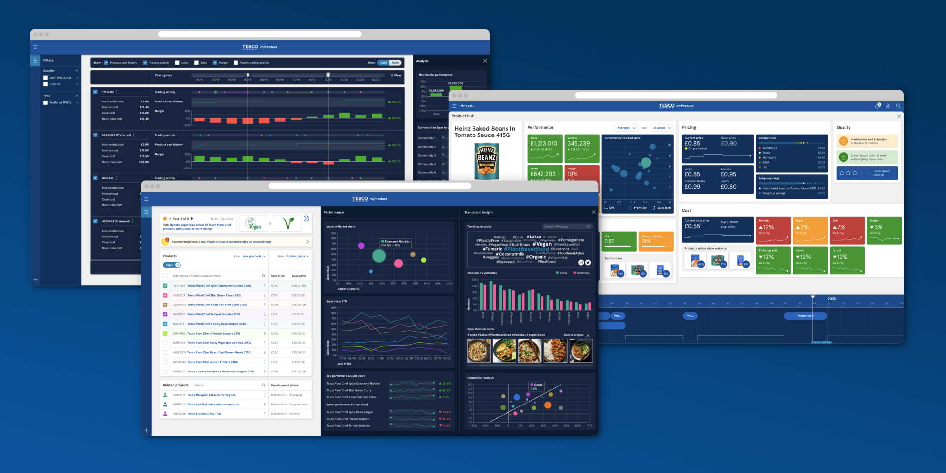
The taxonomy designs allowed users to drill down into categories to find the products they needed and then carry out various actions
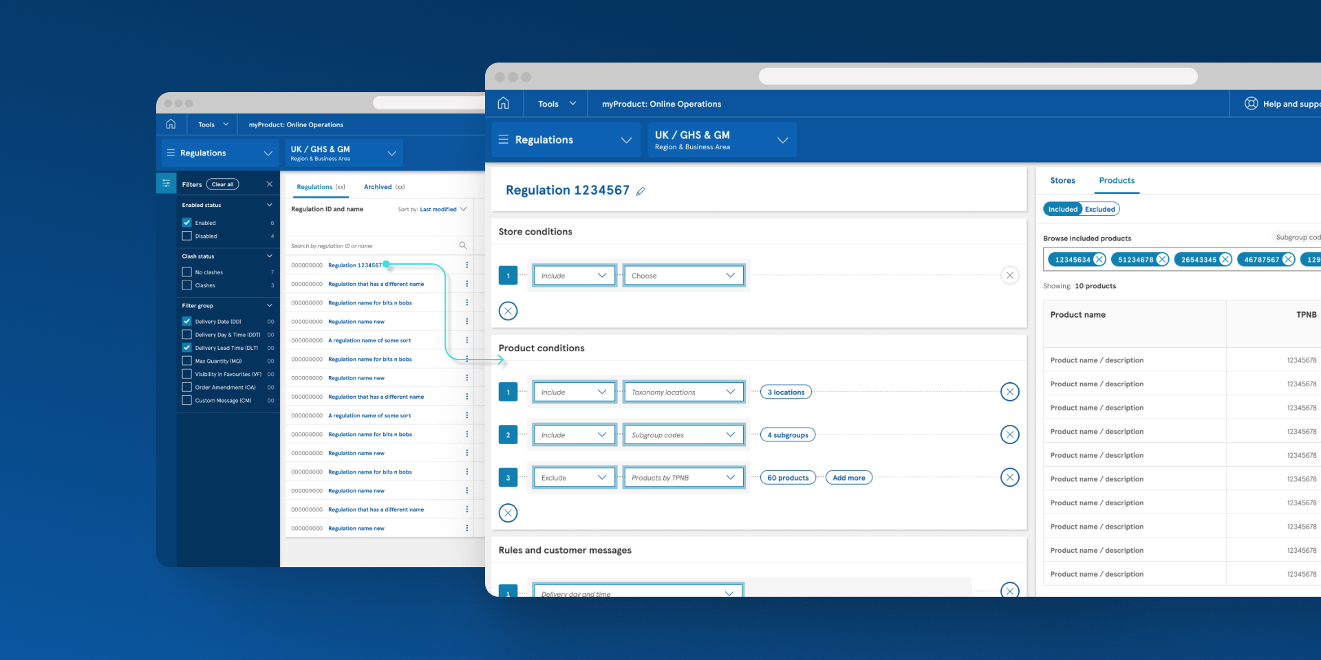
Product regulation gave users a more simplified method for creating and editing their regulations
Results
The response to our work was overwhelmingly positive, receiving incredible feedback. In addition to a substantial amount of positive comments directly from users, we also conducted a System Usability Scale (SUS) survey to gather more quantitative data. This survey was designed to measure various metrics, including efficiency, intuitiveness, ease of use, and overall satisfaction.
Our initial release achieved an outstanding SUS score of A+, representing the highest level of usability. This quantitative validation complemented the qualitative feedback we received, reinforcing that our design and development efforts had not only met but exceeded user expectations.
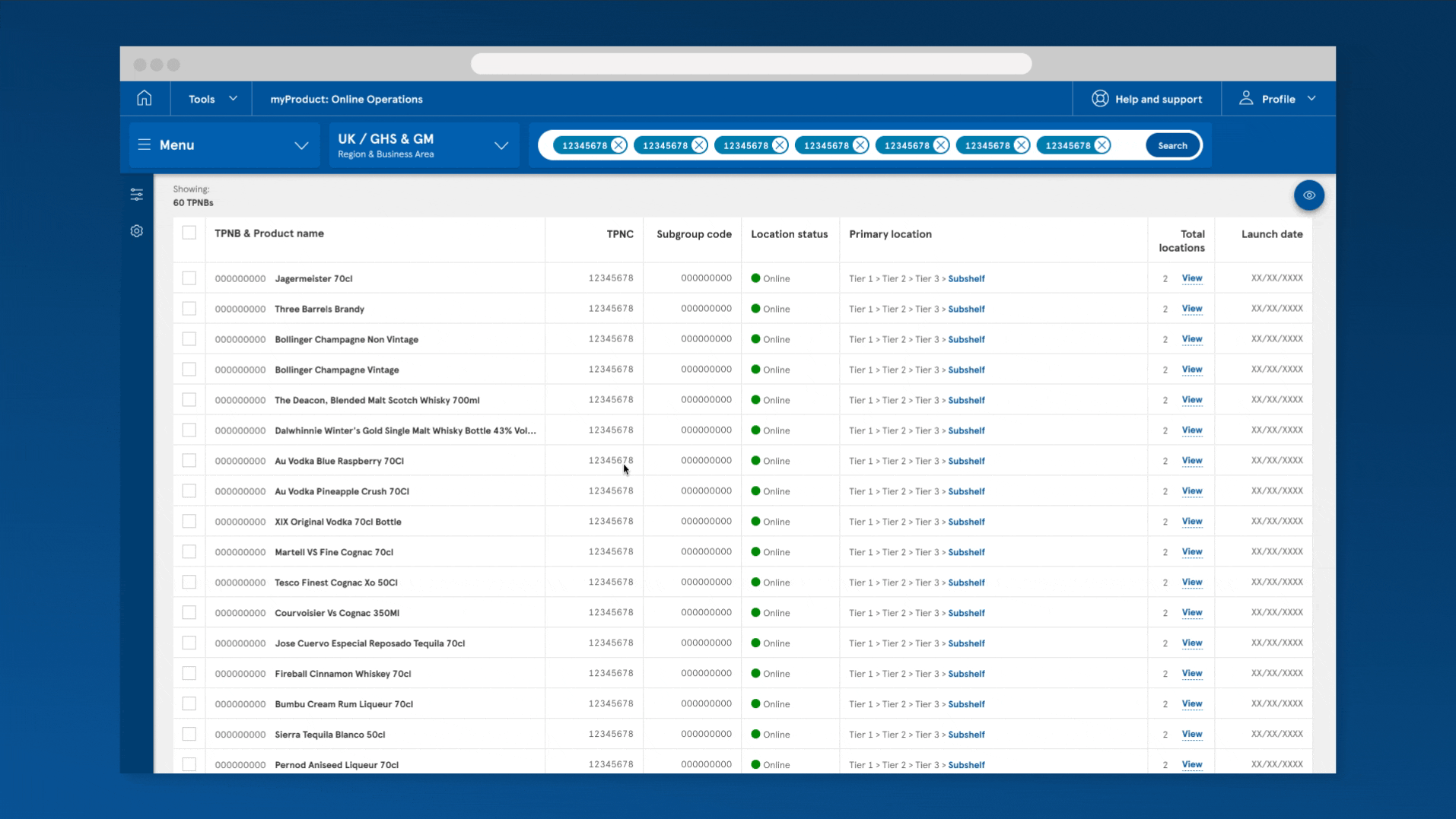
Giving the users the visibility of products to get the information they needed
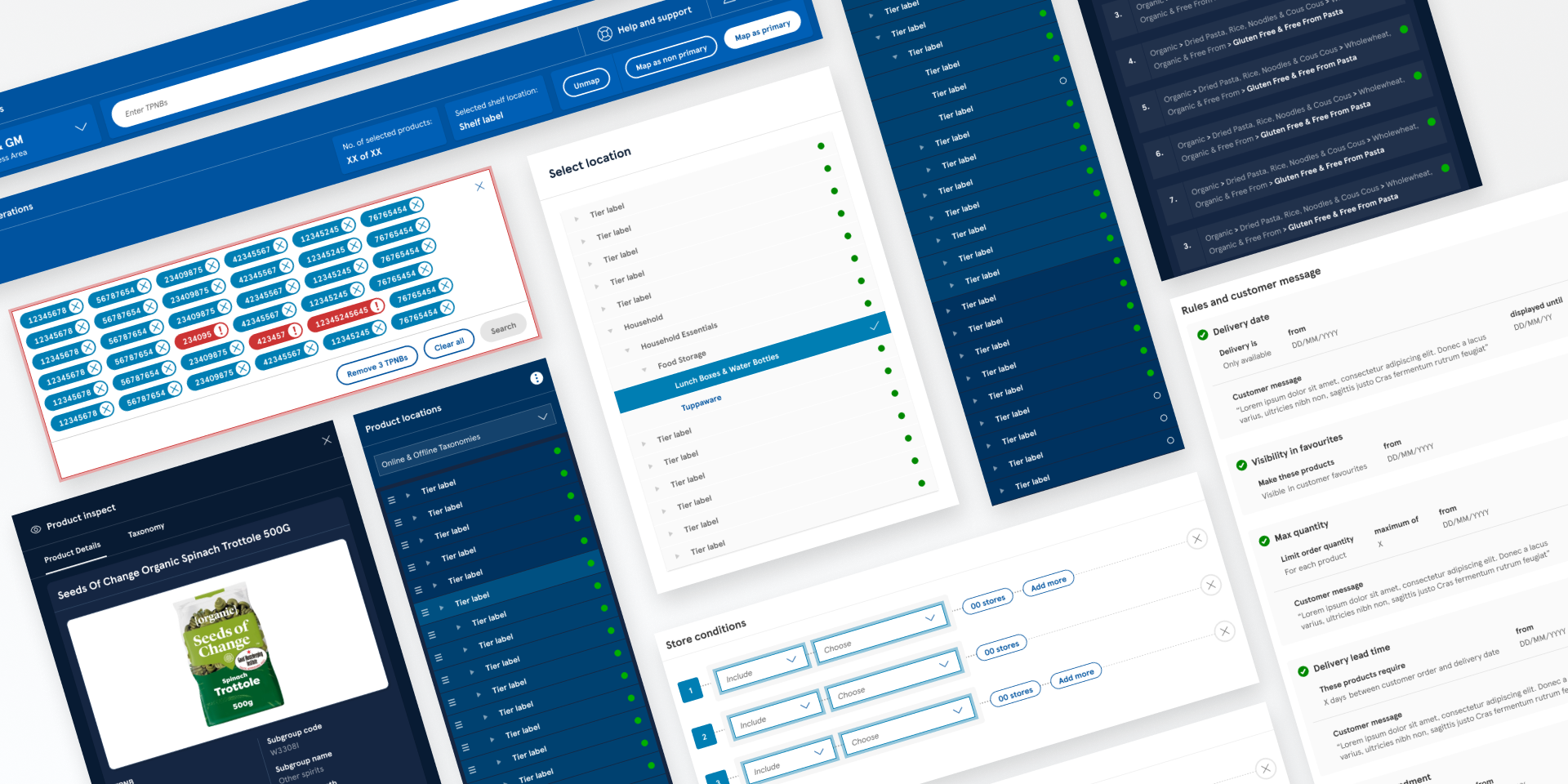
Design patterns that were unique to Online Ops